UPDATE January 4, 2017: I realized that I had mistakenly offset the Grand-Aunt & Uncles by 1 generation, jumping right from “Grand Uncles & Aunts” to “2x-Grand Uncles & Aunts” and leaving our favorite “Great-Grand Uncles & Aunts” out in the cold. It has been fixed and uploaded. If you’d like to skip all of my mumbo-jumbo below, you can Download it directly at this Box link.
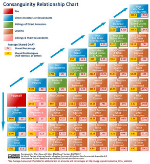
UPDATE February 2, 2016: Now that it is more than 2 years down the road, I’ve taken some time to spice up the chart’s flavor a bit and added a 4th-great-grandparents column, as well as the average shared centimorgans (cM). Average cM is very useful when comparing match data from 23andme’s Relative Finder, for example.
I also added a link right on the chart that will lead people to the Autosomal DNA Statistics over at ISOGG (also linked below in the original post.)
The chart is still licensed under Creative Commons under the Attribution-ShareAlike license, but I added the Non-Commercial option to it. I’m all for sharing with the community, but if a business wants to use it I’d like to have some say. (Of course, if you are an independent genealogist looking to use it in your work for clients, I may be enticed to limit my charge for its use to a cup of coffee or a firm handshake.)
Read on for the original blog post – if you dare!…
Can you say consanguinity? Sure you can.
If unfamiliar with the term, or kind of familiar as I was before I dove headfirst into this whole genealogy world, The Wikipedia nicely defines it this way:
Consanguinity (“blood relation”, comes from the Latin consanguinitas) refers to the property of being from the same kinship as another person.
As one gets going with genealogy, the first real hurdle we need to get past is the whole “What is this ‘eleventeenth cousin thrice removed’ stuff all about?” So, being mostly a visual sort of learner I created a chart to help myself get the idea straight.
Over time I’ve moved on from needing to reference that chart too often, but lately I’ve found I needed a new addition to that cheat sheet – Shared DNA percentages.
Why on earth would one need such a thing? If you’ve had your autosomal DNA tested at 23andme or FTDNA, then you are probably getting hints for new cousins all the time. When the familial connection is not obvious (as it almost always is not), it is a good to know how much DNA one might share with a, say, 4th cousin, so you can start looking in the right part of the old family tree for them.
To give me the visual my brain needs to absorb the info, I created this chart at right. If you’d like a copy for your very own, feel free to click this link and download a full size copy from my Box.com account.
However, shared DNA is not an exact measure of “relatedness” as it falls in the traditional family tree. Due to the random magic of recombination, there is actually a range for how much DNA actually gets passed on from one’s ancestors. For example, while on average one inherits about 50% of each parent’s DNA, the actual amount can be somewhat greater or lesser. As you can imagine – apply that inheritance wiggle room to a 4 or 5 generations between yourself and your match on 23andme and the number can vary quite a bit.
(I suggest reading ISOGG’s Autosomal DNA Statistics page for a nice overview of this whole topic.)
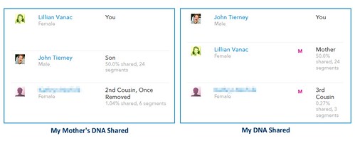
In fact, a recent relatively close match of mine on 23andme illustrates this point nicely – I had a new match show up in my results as a possible 4th cousin, among my highest. Nicely for me, this cousin was on my mother’s side, and she has been tested as well.

Her actual connection to my mother is as a 2nd cousin, once removed, and a plain vanilla 3rd cousin to me.
As such, I should expect to share about 0.781% DNA with her – but because I did not happen to inherit 3 of the segments my my mother shares with her, we only have a third of that amount in common.
Without access to my mother’s results in addition to my own and without the ability to connect to established paper-based research, I easily could have started barking up the wrong tree – and at the 4th or 5th cousin level there are a lot of trees.
So, while I still think the chart is a nice reference to have as a starting point in the process, those shared DNA percentages need to be taken with a grain of deoxyribonucleic acid. or maybe some sodium chloride.
Hope people find the chart useful – I have posted it under a Creative Commons license as listed below.

Consanguinity Chart Now with More DNA Flavor! by John J. Tierney is licensed under a Creative Commons Attribution-ShareAlike 4.0 International License.
Based on a work at http://currach.johnjtierney.com.


