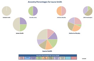
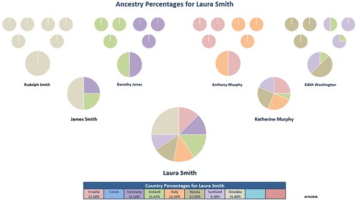
Note: See the Version Updates list at the bottom of this post for exciting new happenings, goings on, and, you know, stuff.
Hello Pie Lovers!
Back in the olden days of 2011 I created an Excel spreadsheet that took the world by… drizzle. But I thought it was cool. This update to my original Ancestry Pie Chart Creator lets you enter the names of you and your ancestors and the names of the countries they came from.
 Then you could enter the percentage of each ancestry for your great-great-grandparents and Voila! .. some nice simple pie charts of your tree.
You can see from the comments on that original blog post a few people used it, like CeCe Moore, which I thought was pretty neat.
After I posted the first Excel sheet I made a few changes to streamline the look a little, then I let it go dormant. But, I always had a few things in it I didn’t like that were due either to limitations in Excel or to my available time to hack my way through them.
When I saw J. Paul Hawthorne’s Excel sheet go pretty viral-y last month, I thought now might be a good time to spruce up the old Ancestry Pie recipe. The one thing I really disliked in Excel was the random color selection it chose when creating pie charts, and that you couldn’t use one chart to paint the rest the same colors. I often thought, “I want my Irish green and my Czech Blue, Dabnabit!” and I didn’t want to have to change the colors of 10 countries in 32 charts every time I ran the thing for a different person, with different countries, who wanted different colors.
Well, with the latest version of Excel, you still can’t paint chart formats. But, I did figure out a way to automate matching the pie chart colors to the ones a user selects for each country. So, without further to do, I have uploaded this latest version of my Excel sheet – it can be downloaded here.
I will warn folks right now – while I did include some summary info on how to use the sheet, and also included a more detailed “Help!” sheet within the Excel file, there may be a bit of a learning curve if you are not familiar with using Excel. Also, I had to use macros (*sharp intake of breath*) to automate the color painting etc.
Because of this, when you open the file Excel might warn you that running macros from Internet downloaded files might be dangerous, scare off your kitty and cause premature hair loss. The macros I wrote are fairly benign, but if you are the cautious type, and you think my blog avatar looks slightly shifty, then this file may not be for you.
I plan to make a video or longer blog post with details on how to use it. But, if you’d like to be the first kid on the block to have some of the newfangled Ancestry Pie (mmmm… pie) then please download it and give it a try. While I can’t promise to offer 24×7 support or any such thing, I welcome comments and suggestions here to help me make it a workable tool for genealogy peoples.

30 NOV 2016
* Added some conditional formatting on the chart pages so that a big yellow warning box will appear above the percentages table if you the ancestries you enter on the Ancestor Entry Sheet add up to more or less than 100%.
26 APR 2016
* Realized Last Modified Date macro was not being called properly. Fixed.
* Simplified color scheme on Ancestor Entry Sheet slightly so that each Paternal/Maternal Ancestor section is Blue or Pink. I found it a little busy with the previously alternating colors for each person.
11 APR 2016
* Added Last Modified date at bottom of each sheet.
* Found that the locked sheets were preventing people from changing the country cell colors – fixed.
* Found that in some cases opening sheet with older versions of Excel (2007 at least), Excel will “forget” formulas that add the names to the pie chart sheets. If this occurs, Excel just keeps the last name that was in the sheet. This does not appear to be happening in later versions, and I will not be fighting this bug at this time.


