• DNA
  • Oct28

    No Comments

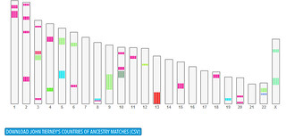
    Countries of Ancestry Chromosome ChartUpdated: November 9, 2015

    For anyone who has been a customer of 23andme, their Countries of Ancestry (CoA) has been a terrific tool in the toolbox.
    Alas – it is going away. You have until November 10th, 2015 to use the tool and even more importantly – Download yer data!

    Put it in the calendar folks.

    Today’s the day your 23andme folks should go out and 23andme – Get the latest Countries of Ancestry Data for all of your profiles there. While 23andme is promising new tools, surely it can only help to have this data in your back pocket for later.

    Also, Bonus tip: In addition downloading your own matches at 23andme itself, you can use the DNA Gedcom.com site to download the CoA data for ALL of your matches! (It is a free tool but see Donate button at bottom of page.) The download process can take awhile, as you provide your 23andme login, it reaches out to get all of the CoA files for you, then places them in a download location.

    DNA Gedcom estimates 30 minutes to an hour for the process, but it took about 20 minutes to download the CoA matches for all 3 of my 23andme profiles, so that is a pretty good speed. Especially considering my wife has an Ashkenazi great-grandfather, so LOTS of matches.

    To reiterate: GO GET YER DATA NOW – who knows how many other users are planning to download today? Could be some bottlenecks ahead.

    Below is part of the original announcement from the 23andme community forums:

    As part of the updates and transition to the new 23andMe, many features will be undergoing significant changes. While we are working to transition customers to the new site, some changes will have an immediate impact on the customer experience in the current 23andMe site, including Countries of Ancestry.

    To provide some context for this change, we wanted to share a number of key principles behind the updates to the 23andMe site and features, including:

    * Simplifying the features and site experience
    * Adding new tools to help customers get the most out of the service
    * Reducing barriers to customer engagement, connection, and communication
    * Maximizing trust and participation by ensuring that users clearly and explicitly opt in to all information sharing

    In consideration of these principles, while some aspects of the feature will be incorporated into the new site, Countries of Ancestry will not be available as a standalone tool in the new 23andMe. The following features of Countries of Ancestry are being removed:

    – The ability to view and download the segments you have in common with members you are not directly sharing with, including public or anonymous DNA Relatives matches.
    – The ability to select any profile you are sharing with and then view and download this same information for that profile.

    In order to conform to our stance on customer privacy, starting on November 11, 2015, Countries of Ancestry will no longer be available. Up until this date, customers may continue to access the web interface and download.


  • Jun12

    No Comments

    Busy, busy, busy lately, so here’s a lazy post on my part, because 23andme did all the work already… Interesting.

    So far my son has inherited my ability to wiggle his ears, although it took some practice and many hilarious facial expressions before he got it.)

    23andMe Genetics: Paternal Connections

    by 23andMe.
    Explore more visuals like this one on the web’s largest information design community – Visually.
  • Feb14

    No Comments

    I was playing around with massaging my 23andme me DNA match data at lunch, and always find it interesting how far flung we all end up. I have 1,053 matches in 23andme’s “Countries of Ancestry” tool (previously aka Ancestry Finder), which is populated with answers your DNA matches provided on the location their grandparents came from

    Of the possible 4,212 grandparents, 1,508 locations were “Not Provided”, and 891 were listed as “United States.” The cousins range from 3rd to Distant.

    My maternal grandparents both came from small towns near to each other in Czechoslovakia, my paternal grandmother came from County Offaly in Ireland, and my paternal great-grandparents also came over from Ireland. All ended up in New York City.

    I can take the paper trail back to the early 1800s on most of my ancestral lines, so it is interesting to see various hotspots in some countries. Obviously, people travel, so my having one match with 4 grandparents from Iran, for example, doesn’t mean I have Iranian ancestry – someone in my line (or a descendant) could have traveled in that direction in the distant past.

    But, I am left wondering with so many Russian, Ukranian, and Scandinavian grandparents listed – did someone head down to the Czech Republic from there, or the other way around. Vikings? (One can hope.) Hopefully one day I’ll find out!

    In any case, the real reason for my post – below is a fun way to view these matches using Batchgeo mapping. I created a spreadsheet that counted up all the grandparent countries, then pasted the data into their page. After a few tweaks of the advanced settings – Voila! A map of the locations using color to indicate the grandparent counts by country.

    View Ancestry Finder Grandparent Country Matches in a full screen map

    Interestingly, when I mapped my wife’s matches in this way, I noticed that she has more matches with grandparents from Poland and Russia than she does the United States! Considering she has no known Polish ancestors at this point, and all of her emigrant ancestors are at great-grandparents and several beyond that, that is kind of interesting. (As I mentioned, I have 3 emigrant grandparents, and 2 emigrant great-grandparents, yet I have more US grandparents in my matches by far. ) Are her Ashkenazi matches from her Russian great-grandfather’s inherited DNA skewing the results?

    I also am wondering if 23andme has published just how many people have been tested with listed ancestry from each country when looking at their entire database. If, say, many more people have been tested in Russia than in Croatia, is that large number of Russian grandparents in my matches’ results showing up because of the larger testing pool in that location, or via a true ancestral connection in my DNA? Hmm. To be continued, I suspect.

    Finally, one thing I noticed with the BatchGeo mapping tool – the grouping of results by color is kind of skewed, and there is no way I see to change it. For example, the lowest color coded grouping is “1-3” and my highest is “124-891” – I would like to even out those groupings to make it more honest to the eye.

    My wife’s map, below:

    View Map of 23andme Match Grandparent Countries – LT in a full screen map

  • Dec2

    9 Comments

    UPDATE January 4, 2017: I realized that I had mistakenly offset the Grand-Aunt & Uncles by 1 generation, jumping right from “Grand Uncles & Aunts” to “2x-Grand Uncles & Aunts” and leaving our favorite “Great-Grand Uncles & Aunts” out in the cold. It has been fixed and uploaded. If you’d like to skip all of my mumbo-jumbo below, you can Download it directly at this Box link.

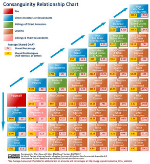
    UPDATE February 2, 2016: Now that it is more than 2 years down the road, I’ve taken some time to spice up the chart’s flavor a bit and added a 4th-great-grandparents column, as well as the average shared centimorgans (cM). Average cM is very useful when comparing match data from 23andme’s Relative Finder, for example.

    I also added a link right on the chart that will lead people to the Autosomal DNA Statistics over at ISOGG (also linked below in the original post.)

    The chart is still licensed under Creative Commons under the Attribution-ShareAlike license, but I added the Non-Commercial option to it. I’m all for sharing with the community, but if a business wants to use it I’d like to have some say. (Of course, if you are an independent genealogist looking to use it in your work for clients, I may be enticed to limit my charge for its use to a cup of coffee or a firm handshake.)

    Read on for the original blog post – if you dare!…

    Can you say consanguinity? Sure you can.

    If unfamiliar with the term, or kind of familiar as I was before I dove headfirst into this whole genealogy world, The Wikipedia nicely defines it this way:

    Consanguinity (“blood relation”, comes from the Latin consanguinitas) refers to the property of being from the same kinship as another person.

    As one gets going with genealogy, the first real hurdle we need to get past is the whole “What is this ‘eleventeenth cousin thrice removed’ stuff all about?” So, being mostly a visual sort of learner I created a chart to help myself get the idea straight.

    Over time I’ve moved on from needing to reference that chart too often, but lately I’ve found I needed a new addition to that cheat sheet – Shared DNA percentages.

    Why on earth would one need such a thing? If you’ve had your autosomal DNA tested at 23andme or FTDNA, then you are probably getting hints for new cousins all the time. When the familial connection is not obvious (as it almost always is not), it is a good to know how much DNA one might share with a, say, 4th cousin, so you can start looking in the right part of the old family tree for them.

    Consanguinity Chart Now With More DNA Flavor!

    To give me the visual my brain needs to absorb the info, I created this chart at right. If you’d like a copy for your very own, feel free to click this link and download a full size copy from my Box.com account.

    However, shared DNA is not an exact measure of “relatedness” as it falls in the traditional family tree. Due to the random magic of recombination, there is actually a range for how much DNA actually gets passed on from one’s ancestors. For example, while on average one inherits about 50% of each parent’s DNA, the actual amount can be somewhat greater or lesser. As you can imagine – apply that inheritance wiggle room to a 4 or 5 generations between yourself and your match on 23andme and the number can vary quite a bit.

    (I suggest reading ISOGG’s Autosomal DNA Statistics page for a nice overview of this whole topic.)

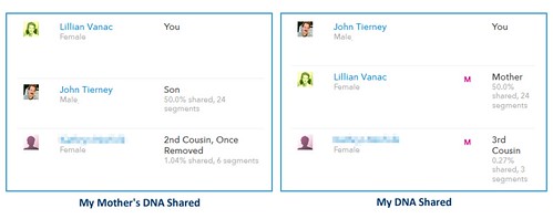
    In fact, a recent relatively close match of mine on 23andme illustrates this point nicely – I had a new match show up in my results as a possible 4th cousin, among my highest. Nicely for me, this cousin was on my mother’s side, and she has been tested as well.

    23andme Cousin Match Comparison
    Using my handy-dandy consanguinity chart, at 0.27% shared DNA over 3 segments, one can see the result is a bit above the 4th cousin level. All righty! But, if you look at what my mother shares with this same cousin you’ll notice a disparity in the estimate – they share 1.04% over 6 segments. The other good news in this particular match was that she had an obvious surname and location in her profile that I knew about – and is the first person I have been able to find that I can tie directly into my known genealogical research.

    Her actual connection to my mother is as a 2nd cousin, once removed, and a plain vanilla 3rd cousin to me.

    As such, I should expect to share about 0.781% DNA with her – but because I did not happen to inherit 3 of the segments my my mother shares with her, we only have a third of that amount in common.

    Without access to my mother’s results in addition to my own and without the ability to connect to established paper-based research, I easily could have started barking up the wrong tree – and at the 4th or 5th cousin level there are a lot of trees.

    So, while I still think the chart is a nice reference to have as a starting point in the process, those shared DNA percentages need to be taken with a grain of deoxyribonucleic acid. or maybe some sodium chloride.

    Hope people find the chart useful – I have posted it under a Creative Commons license as listed below.

    Creative Commons License
    Consanguinity Chart Now with More DNA Flavor! by John J. Tierney is licensed under a Creative Commons Attribution-ShareAlike 4.0 International License.
    Based on a work at http://currach.johnjtierney.com.

  • Feb20

    No Comments

    My 23andme Ancestry Composition Chart

    Click image for larger version.

    23andme recently released a new Ancestry Composition tool that “tells you what percentage of your DNA comes from each of 22 populations worldwide.”

    It is a nicely designed chart – although according to discussion on their forums and even my own results, the specificity seems to affected by the current size of the comparison data set.

    My ancestry is 50% Irish and 50% Czech and I can name the exact towns where 6 out of 8 of my great-grandparents came from. My 99.6% reported European ancestry is purported to be in the “sweet spot” of their data – however my results have a fair amount of “Nonspecific” percentages. They also show what I think is probably noise in their analysis with tiny amounts of South Asian, Middle Eastern and North African in there as well.

    With 23andme’s big push to reach a database of a million people, it will be interesting to see how this composition chart changes over time – assuming they update it regularly as new information becomes available. (Some other reference info on the site has not seemed to keep up with the times.)

    Overall, I am quite happy with the service and hopefully I’ll find a match one day that will help me find where them long lost Tierneys came from back in Ireland.